
Extreme Response International
Branding & Outreach
Client: Extreme Response International
Role: Brand Strategy, Creative Direction, Graphic Design
“I've had the distinct pleasure of working with Quentin Smith for six years at Extreme Response. He is a gifted marketing specialist and the "go-to" person for our major projects. Quentin exhibits all the qualities you want in a leader. He is highly creative, precise, conscientious and never misses a deadline. He understands the macro aspects of branding, as well as the micro aspects of great design and communications. On top of that, Quentin places high value on family, charitable causes and volunteering.” — Tim Fausch, Communications Director

Introduction of Brand
Extreme Response International (ER) exists to change the lives of people living in extreme situations. They are committed to investing in the lives of vulnerable people and to helping them break free from generational poverty. Their impact is strengthened through strategic partnerships with community-based organizations. This tactic is grounded in one of their core beliefs that while money changes circumstances, it’s through relationships that genuine life change takes place. ER strives to build and maintain meaningful relationships at every level, from those they serve to strategic partners to donors to volunteers. ER is a registered not-for-profit organization in the United States, Canada, Ecuador, Philippines, as well as South Africa.


Three different banners used at outreach- and donor-related events.
Key Learnings
Make them look good but not too good
While it was important for ER to look professional, it was equally important for the organization to not look too high-quality. Otherwise, donors were less likely to donate because they feel the organization appears to have enough money.
Set them up for future success
As a volunteer, I knew non-designers would use my files in the future. Therefore, I made sure to create communication materials in such a way that other team members with limited design skills could update the files with ease.
Employ emotional appeal to connect
To effectively connect with supporters, current and potential, it was essential to appeal consistently to the target audiences’ emotions, including hope, love, and unity, to display the impact they can have by getting involved.

Special event flyer, created annual. One for each location.
Background
After attending two humanitarian trips, to Quito, Ecuador and to various areas of South Africa, I was impressed at the impact the organization was having. The experience affected me so much that I wanted to help extend their efforts. In 2012, I started donating my time along with my graphic design and marketing expertise to the non-profit organization. For eight years, I partnered with the founders and its communication director as a design and marketing volunteer to improve the organization's visual identity, online presence, brand awareness, as well as increase donations and grow the number of volunteers.


Gatefold brochure, delivered to perspective donors and volunteers.
The Challenge
Getting involved with ER opened my eyes to the struggles of a non-profit organization looking to appear legitimate to current and potential donors while not having the resources needed to succeed. ER had no brand or outreach strategy, minimal budget, along with a small set of communication materials that were visually outdated and inconsistent looking. Each of these challenges are no strangers to NPOs. The key creative challenge I faced was in reworking the visual branding of ER. The founders felt strongly about retaining the “X” as a core component of their logo while also maintaining red as its primary color.

Volunteer dri-fit t-shirt.
Creative Leadership
I was one of four creative professionals volunteering their time to the organization, a graphic designer in Canada, a copywriter in Los Angeles, along with a photographer and videographer in Seattle. Albeit, I was the person with the most diverse design background. Respectively, I led the creative team, along with contractors including a web agency and multiple printers.
As the developer of the brand standards, I led the charge to roll them out to the entire organization through emails, virtual meetings, and one-on-one discussions. Afterwards, I served as a brand compliant officer with all communication materials running through me to ensure they follow the new brand standards—strengthening the perception of ER.

Final primary logo.

Final secondary logo.

Branded QR code.

Initial logo concepts.
Visual Branding
During my time with the organization, I contributed in multiple ways. The first was redesigning ER’s visual identity, including their logo, brand icon, custom QR code, as well as building and implementing their brand standards. Longterm, the client wanted a whole new update on their visual branding. Consequently, my brand refresh was to serve as a bridge from the past to the future. The client required a continuation of using an “X” as a primary element of the logo lockup, to represent removing vulnerable people from the often life-threatening situations they face daily. Additionally, the “X” was developed to be used with and without the wordmark, as well as a creative element, such as housing imagery and as a creative component of a design.

Redesign website.

Original website.
Brand Website
The entire ER leadership team and myself worked together to launch a completely new website telling the organization’s story while greatly improving the users’ experience. From building the site map to designing the user interface to communicating content needs with the copywriter and photographer to managing the programming by working with a digital agency, I led the task of updating the brand website.


Leader's workbook used during training sessions.


Set of leadership training cards.
Leadership Materials
A large part of what ER does is building individuals into strong leaders to better lead their own community organization. Yet, to effectively and efficiently grow these individuals’ leadership capabilities, there was a need for certain resources. I partnered with the organization’s co-founder and chief strategy officer who also led ER’s leadership development division, Leader Mundial, to build training materials including workbooks, presentations, and training cards. Additionally, I pitched several items however they did not progress beyond the concept stage due to budget constraints.

Conceptual leader's journal.
Additional Visual Signifiers
As part of my initiative, I revitalized the organization's social media presence by managing their platforms, including developing content, scheduling posts, and analyzing user data. During the eight years I partnered with ER, social media posts became consistent with engagement more than doubling, and a considerable increase in the amount of donations, volunteers, and supporters. Additionally, I developed a range of volunteer appreciation, fundraising, and outreach communication tactics.

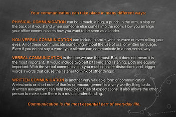
Conceptual leadership poster.
Skill Set
Skill sets employed throughout the ER project includes, creative direction, graphic design, project management, brand strategy, outreach strategy, team leadership, and print product management. Technical programs used to build the creative are all Adobe Creative Cloud products, InDesign, Illustrator, and Photoshop. Microsoft Excel and Word along with Hootsuite were employed for social media management. Additionally, Facebook Insights was used to analyze ER’s social media presence.